

Dashboard tour
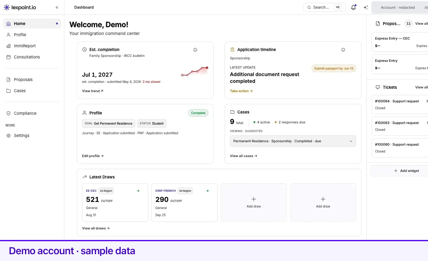
/app/dashboard is the home screen of Lexpoint and the screen the logo returns you to. It has five regions, and each one has a job.
The left sidebar
Section titled “The left sidebar”The sidebar is the same on every /app screen. It is your map of the product, grouped so the order
means something:
| Group | Items |
|---|---|
| Who you are | Home, Profile, ImmiReport, Consultations |
| What you are doing | Proposals, Cases |
| What you are tracking | Compliance |
| More | Settings, Rate Us |
The current section is highlighted with a coloured icon and a dot. ImmiReport is only in the list when a report applies to your situation.
Collapse the sidebar to icons with the control beside the logo — it stays collapsed on your next visit. Hovering over a collapsed icon reveals its name. A theme toggle sits at the very bottom.
On a phone the sidebar is hidden and opens from the menu button at the far left of the top bar.
The top bar
Section titled “The top bar”A fixed 48-pixel strip across the top of every screen.
| Control | What it does |
|---|---|
| Breadcrumb | Where you are. On mobile this collapses to a back arrow and the current page name. |
| Search… with a ⌘K hint | Opens the command palette. Type to filter, then jump to a page. |
| Bell | Notifications and announcements. A dot appears when something is unread. See Notifications and the updates feed. |
| Lexi | Opens the assistant drawer, where it is available to you. |
| Question mark | Opens support — get help or send feedback. |
| Avatar | Settings, tickets, billing, and sign out. |
The main column
Section titled “The main column”Everything under the top bar and left of the sidebar, read top to bottom:
- The welcome line — a Welcome greeting with your first name, and a subtitle matched to your situation.
- One attention banner, at most — or none. See The attention banner.
- The widget grid — up to three rows of two, so six widgets at most. This is the part that differs between accounts and the part you can rearrange. Every widget is listed in the widget reference.
- The quick actions strip — a row of chips below the grid. It is fixed: it is not a widget, it cannot be moved, and it does not count against the six slots.
| Chip | What it does |
|---|---|
| Widgets | Opens the widget picker, with your slot count beside it — see Choosing and ordering widgets. |
| Contact Us | Opens support. |
| Update Profile | Goes to your profile. |
| Book a Call | Opens consultation booking without leaving the page. |
| View ImmiReport | Appears only when you have a report and the ImmiReport widget is on your dashboard. |
The attention banner
Section titled “The attention banner”Lexpoint shows the highest-priority prompt that applies to you and suppresses the rest, so banners never stack. When nothing applies, there is no banner.
| Priority | Banner | Who sees it |
|---|---|---|
| 1 | Finish your profile, or a pending review of your details | Accounts with profile sections still open or a review outstanding. Not shown to the accounts in row 3. |
| 2 | Verify your identity | Accounts linked to an employer that have not completed identity verification. |
| 3 | Coming Soon — We’re building features for you, with Talk to a Consultant | Canadian citizens, and permanent residents living in Canada. They see nothing below this row. |
| 4 | Invite {name} to connect your accounts | Your profile lists a spouse or common-law partner whose account is not connected to yours, and no invite is pending. Invite {name} → opens your invites; Add their email to invite → appears when their family record has no email. Not now hides it for good. See Link with your partner. |
| 5 | A request for feedback | Accounts with a complete profile that have not rated Lexpoint yet. Dismissing it hides it for 24 hours. |
The right sidebar
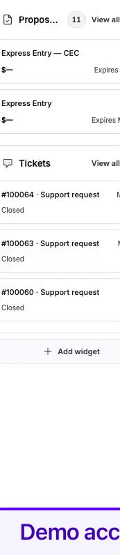
Section titled “The right sidebar”A narrow column on the right, on wide screens only. It carries up to three blocks, and starts with Consultations and Proposals. Cases, Tickets, and Updates can be added in their place.
If you have never arranged the sidebar, Cases is placed third when a permanent-residence case with us has been submitted, or when you hold both a permanent-residence and a temporary-residence case.
Consultation times in the sidebar are shown in your own time zone, with its label — for example 4:07 PM EDT.
Below the widest breakpoint the column is hidden and the Consultations and Proposals cards move into the main column instead, so nothing is lost on a phone.
What is saved and where
Section titled “What is saved and where”Your layout follows your account, not your browser — arrangements are stored server-side, so the dashboard you build on a laptop is the dashboard you open on a phone. The sidebar’s collapsed state and your theme are the exceptions: those are per-browser.
Adding, removing, or moving a widget saves and then reloads the dashboard with a short branded overlay, because the widget data itself is calculated on the server.
Related
Section titled “Related”- Widget reference — every widget and why one might not appear
- Choosing and ordering widgets — how to change what is in the grid
- Notifications and the updates feed — the bell and the Updates block
- Getting started — signing in and the first things to set up
- Your account — settings, security, and preferences
Frequently asked questions
Why does my dashboard look different from someone else's?
The widget grid, the attention banner, and the right sidebar are built from what is true for your account — your profile, your report, your cases, what you have told Lexpoint about your own journey — and from any arrangement you have saved.
Where did the right sidebar go?
It only appears on wide screens. On a narrow window or a phone, Consultations and Proposals move into the main column instead and the other blocks are reached from their own pages.
Is there a faster way to move around than the sidebar?
Press ⌘K (Ctrl+K on Windows) anywhere in the app to open search and jump straight to a page.